Purple Magazine
— Purple 76 Index issue #29 S/S 2018

M/M (paris)

posters
ideas
fonts
films
advertising
packaging
dialogs
labels
exhibitions
furniture
magazines
products
carpets
books
interfaces
collaborations
fashion stories
sculptures
theater sets
art installations
systems
album covers
opera sets

portrait by PAOLO ROVERSI
interview by JÉRÔME SANS
photography by M/M (Paris)
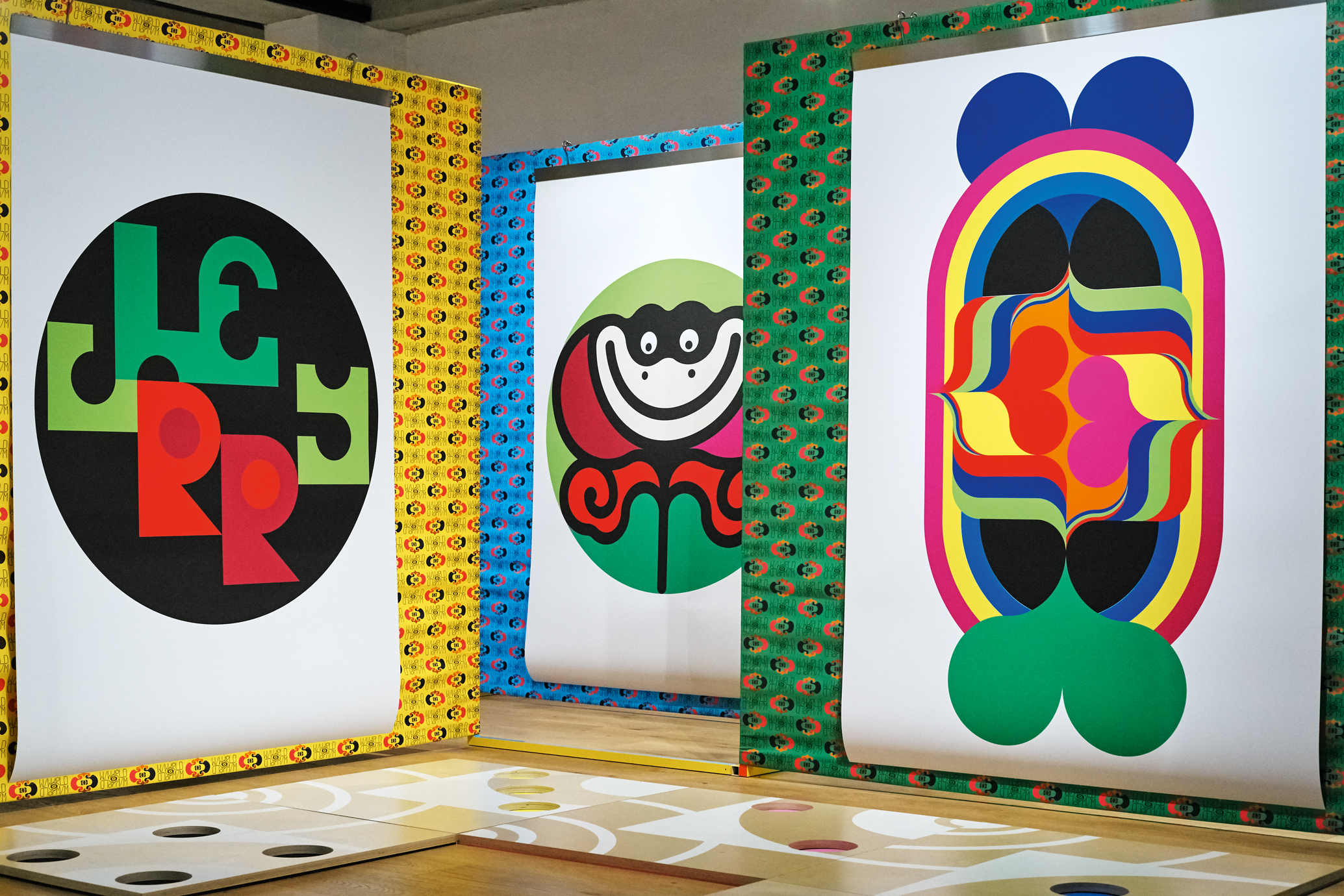
‘M/M aime/aime,’ installation view, Seoul, 2017

JÉRÔME SANS — How do you define yourselves these days? Artistic directors, artists, doers, image makers? I wouldn’t go so far as to say graphic designers, because I know you hate that.

M/M — We’ve always considered ourselves artists. We were trained as artists — in the most open way, where the idea wasn’t to sell works of art but to think carefully about the world. When we started working together, at the end of the 20th century, there was no Internet or social media, and people traveled much less than today. We had to dream up a tool that would allow us to express ourselves, and project our voice throughout the world. We were part of a generation that still conceived of art as being active and effective. The idea wasn’t to amass a stock of artistic merchandise that we would then sell. From the beginning, we sought to make images that would be inside the world, that would set things in motion and interlink them. So we set up a production studio, where the main activity was graphic design, artistic direction, or image-making. We knew by intuition that it would be a viable strategy, allowing us to operate at the nexus of multiple art and media networks, and especially of different worlds.

JÉRÔME SANS — And did you at the time have models, like artistic director Peter Saville?

M/M — No, because Peter Saville — or let’s say Grapus, in order to open this discussion to another unexpected yet obvious reference — were seen and considered graphic designers in the proper sense of the term. In the way we conceived of our work, there wasn’t really a model. Of course, if you dig a little into the history of art, you find several models. You might cite General Idea, with their magazine File, but that group of artists was more utopian than we were. They’d stick more to the prototype stage, whereas we wanted to think up a prototype that would become real! We also watched artists put together alternative projects of that sort — restaurants, for example. You might think of Gordon Matta-Clark too. There were projects like that in art, and they were present in our unconscious.

JÉRÔME SANS — There was also Keith Haring’s Pop Shop.

M/M — Right. So that aspect of things was unconsciously present for us, but there was also fashion, which was already represented by certain artists, but only superficially — never in a well-considered, well-analyzed way, as a worthy subject for reflection. There was also music, and Andy Warhol and The Factory, who declared that a band could be a work of art. We were surrounded by all these influences. We were hitting the scene right afterward. So we thought, “Why not reflect on the world, but not from a purely theoretical or aesthetic point of view? From a real office, anchored in the real world, so that we could make real objects.” That’s what we called the place where we worked: “the office.” Our whole way of doing things had this simple, naive side to it. By contrast, in our generation we’ve often been associated with artists like Philippe Parreno, Pierre Huyghe, and Dominique Gonzalez-Foerster, because they had a pretty similar approach — the desire to be anchored in reality and “the material.”

JÉRÔME SANS — But they still confined themselves to more dream-like worlds.

M/M — The fundamental difference is that we’ve always sought to interact completely with the real, the present. We didn’t want to work on “false” projects.

JÉRÔME SANS — Back then, in the art world, you’d often hear expressions like “That could be…” or “That would look like…” The postulates were always in the conditional.

M/M — Yes. So if Maurizio Cattelan and Philippe Parreno, for example, presented a possible TV set model for Nicolas Bourriaud’s exhibition Traffic, we were questioning the validity of this proposal in such a context. If we were going to make a TV set, we’d make a real TV set. By the way, we’ve never wanted to make a television, because we find it an old medium. Anyway, that sometimes provoked disagreements, but they were constructive conversations. The culmination of our encounter with Pierre Huyghe and Philippe Parreno was probably the Annlee project. [Annlee is a 2-D manga character that Pierre Huygue and Philippe Parreno purchased in 1999 from a Japanese company that supplies manga characters to publishers.] This was indeed the joining together of two positions: theirs, that of two artists active in the world of contemporary art, and ours, that of two artists rooted expressly in the real world. With the Annlee project we were able to pool our resources. “If you want your character to exist,” we said, “we have to provide it with a presence, the kind of presence that artistic directors and graphic artists provide. For this project we’re going to put together some propaganda worthy of the name. Without it the character wouldn’t exist.” At about that same time, we did Café Etienne Marcel in Paris and several other projects together.

JÉRÔME SANS — That precisely is what’s interesting about you two. You have a very particular way of working. Unlike most artistic directors, who impose their vision unilaterally, you seem to look for a point of convergence, or even hybridization, between the world that you’re supposed to design and your own world. You’re more about collaborating with than working for. I’m not thinking specifically about your collaborations with fashion brands or plastic artists. When you worked with Etienne Daho, you weren’t just making an album cover — it was more than a cover.

M/M — We have to take into account that Nicolas Bourriaud wrote Relational Aesthetics at that time. We took his text to heart. We were in agreement with the thesis of that manifesto, according to which the criterion for art was that it put into contact the individuals of a group, who would collaborate and actively converse. What we’ve seen with many artists of our generation is a simulation of collaboration, which has often ended badly. The way we do things, if we work with someone, we’re not at their service, nor are we there to control them. In other words, we’re never going to make use of another artist or creator so that we can put ourselves above them, or raise ourselves to some higher level in a hierarchy. This is also why we were considered “difficult” at the beginning of our career. What we were trying to do with our work was establish the one-on-one relationship, the aesthetic of conversation.

JÉRÔME SANS — And you seemed all the more “difficult” for being two of those rare people who choose whom they work with and how. 

M/M — The thing is, you can prompt an encounter, but you can’t force one. Now, that sometimes leads to misunderstandings. People will suddenly try to tame us, or appropriate something that belongs to us. And, indeed, when you examine our projects closely, you see that they have an uncommon tendency to endure. Seven or eight years working for the same brands? That’s unusual. People often bring up the work we did with the Théâtre de Lorient. That has lasted more than 20 years. It’s unheard of. Not to blow things out of proportion, but these serial collaborations — people talk about them the same way they talk about Rothko’s series, precisely in the sense of a single technique and a single form that are repeated with the barest transformation, that are reworked with tiny differences, that are “remastered” over time, without the work’s ever feeling dated or shopworn in any way whatsoever.

JÉRÔME SANS — We can put a finer point on your exceptional method of operation by adding that for you there is no hegemony in terms of notoriety, no hierarchy of people you collaborate with. It might be an unknown young artist who’s sent you a record you’ve liked, or it might be the Théâtre de Lorient… As your profile rose, you could easily have decided to work only with the most prestigious brands and artists. 

M/M — The important thing is to generate projects at every scale. At times, we’ve found ourselves meeting strange people and doing strange or even impossible projects — or so improbable that people don’t believe us. [Greek industrialist and art collector] Dakis Joannou, for example, could have been content to collect our work, but he asked for something else. He asked us to create for him a kind of system or procedure that would allow him to collect fashion. Within a dozen years he’d put together his collection, and we did the catalogue, which contains the entirety of that very interesting and singular project.

JÉRÔME SANS — Your approach to graphic design, your thinking, and your mode of operation have exerted a broad influence on the artistic landscape ever since the 1990s. How would you now describe the evolution of your personal approach, and what it might have inspired in others?

M/M — It’s hard to comment on the effects of your own work. We’ve probably opened up certain possibilities, but that’s on the surface. What we’ve really made it possible to do is to say while you’re still young that you can start your story on your own and establish a design group with two or more people. It’s rather touching to think we’ve opened up the creative landscape in France and spur initiatives of that sort. Where we’ve really had an influence is in the so-called multi-format approach. In other words, when you do what you do you also think about making various versions of it — for example, a table, a poster, an opera set, pins, and a collaboration with a singer.

JÉRÔME SANS — Posters, ad campaigns, films, exhibitions, album covers, books, furniture, sculptures, art installations, theater sets, magazines, opera sets…

M/M — Right. And we’re forgetting something that took us a long time, and doesn’t often come up when the conversation turns to us — the relationship with teaching. We’ve added that as a mission, because — you’ve got to be honest — there comes a time when you’re going to have to do some teaching. For us that meant six years at ECAL, in Switzerland. We’ve trained people who’ve gone on to become collaborators and competitors. But we didn’t want to become teachers. We lacked both the skill and the time. We gave those courses thinking there’d be a beginning, a middle, and an end.

JÉRÔME SANS — It’s a bit like Black Mountain College, the famous experimental college that John Andrew Rice and Theodore Dreier founded in 1933 in the North Carolina Black Mountains, to get artists such as Cy Twombly, John Cage, Allen Ginsberg out of New York and Los Angeles, and gather them elsewhere, for the invention of new forms.

M/M — Yes, and that’s exactly what Pierre Keller made room for back when he was director of the École Cantonale d’Art de Lausanne. The site was pretty improbable. It was a former paint factory on the outskirts of Lausanne. Lausanne is already no metropolis, just a pretty little lakeside town. At this school we weren’t even lakeside anymore. We were in a sinister spot, withdrawn from the world, which led to some pretty madcap experiments. The experience left its mark on the students. Even today there are fleeting traces of us in the graphic-art department of ECAL — in the general manner of the students, especially in the way the teachers draft their briefs. It’s a bit as if our ghosts were still there to influence them.

JÉRÔME SANS — Might we say that your approach is related to the Gesamtkunstwerk, the total work of art, where the work has no privileged territory and almost anything can serve as the basis on which to build a world? Incidentally, I wanted to title this interview “The Whole World,” because when I look at your works that’s what I feel.

M/M — That reminds us of the encyclopedia called Tout l’Univers. It was a good title because the beautiful thing was that when you opened it you knew that you weren’t going to find “the whole world,” but rather the whole world from the viewpoint of certain people. Unlike Bauhaus, we’ve never pretended to remake the world. There are two of us, M and M, and we remake the world on our scale. Also, this notion of the world recalls the adolescent obsession with transforming your room in order to make your own world. It’s more or less the same with us. We try to design everything — the bed, the walls, the doorknob, the clothes… In fact, we did that with our album covers. It was like an unhealthy obsession. We could not stop ourselves from customizing them, as if nothing could ever be beautiful enough for us — or, rather, could never hew closely enough to our tastes and our thinking. Even when an album cover had a superb photo something would drive us to reappropriate it.

JÉRÔME SANS — What comes across in your vocabulary is precisely the co-presence of drawing and the image. Drawing is present in almost all of your productions. It’s like the thread running through it all.

M/M — At M/M, the practice of drawing serves an almost didactic purpose. If we draw in one spot, the idea is to bring in a supplementary element for the comprehension of the image. Technical mastery doesn’t matter. We like things to be drawn. We like to have several situations, actions, and spaces to comprehend one another, literally.

JÉRÔME SANS — Sometimes your drawings recall tattoos. I’m thinking in particular of certain album covers, where the drawing sits on top like a teardrop on a superimposed screen.

M/M — Yes. For example, the first cover we did for Björk, for her album Vespertine — we allowed ourselves to draw on her face. Today that seems simple and obvious, because if you recall the context — Björk was a superstar, an omnipresent icon in the media, and when we met her to work on Vespertine, she was at a watershed moment in her career. We very subtly hinted that she wanted to distance herself from her somewhat techno-immaterial girlish image to become a little more feminine, let’s say. So we came to an agreement with photographers Inez and Vinoodh to do a photo that would bring out a more sensual image of her. And, to put a little more emphasis on it, we drew a swan on the photo. There’s a painting by Leonardo da Vinci of a virgin on which Freud outlined on her dress something other than what you’d expect to see there [the form of a vulture]. Éric Troncy saw the cover back then and thought we were making a reference to Freud’s interpretation. That wasn’t the case, but there was indeed a psychoanalytic relation to the unconsciousness of the image. The process was: we have a photo and we can add a visually shimmering layer, but its function must be to bring out something else.

JÉRÔME SANS — You’ve shaken up the traditional relationship to the image, which for a rock star, say, is: you will photograph me head-on, you will alter neither my body nor my image, I will take up all the space, and you will under no circumstances superimpose any stronger element over my body.

M/M — You don’t realize that that’s the case, but, of course, it absolutely is. Much later, when we did some work for Vanessa Paradis, we used the same procedure. We infused her with things that the human eye cannot see. We add what we think we see, what’s there for us, and seems to us obvious and necessary. It’s a bit like John Carpenter’s film They Live, where you can see a hidden reality through scanner-sunglasses. Talking about this groundbreaking aspect of our work recalls a meeting we had one day at Vogue…

JÉRÔME SANS — Whose art department you headed up for two years, right around the year 2000.

M/M — Yes, and the magazine’s editor-in-chief had a little trouble getting used to us, and understanding what we were doing there. It’s true that we didn’t really realize it, but suddenly most of the ad pages in the magazine were for ads that we had done — and rather “loud” ones at that. There was a Calvin Klein ad, for example, where we’d covered some iconic brand photos with graffiti, as if Calvin Klein himself had signed on top of his own logo. And there was that Balenciaga ad, with the decapitated head of Christy Turlington set on a kind of Dali-esque tripod. During this meeting at Vogue the editor-in-chief, thumbing through the magazine, looked as us somewhat taken aback and asked: “What’s all this?” We hadn’t yet realized and wanted to say: “We don’t get it. What’s the problem?” It’s true in hindsight that we open those issues of Vogue and can’t help but find it strange. But that strangeness is exactly what we’re trying to talk about. For every image of the people we’ve worked with we’ve always wanted to bring out something that would constitute a portrait. For us that logically entails a more pictorial kind of work.

JÉRÔME SANS — This brings us to a series of posters you did for a some artists. When you did the ones for Liam Gillick and Rirkrit Tiravanija, you brought them out of a plastic vocabulary that they had no notion of at the time. In other words, in a totally different but totally faithful way, you managed to transpose on these posters things that they themselves hadn’t yet incorporated into their own artistic process.

M/M — We’ve done a lot of posters for artists of our generation, like Liam Gillick and Rirkrit Tiravanija, and we continue to do them, but less often, because the collaborations have evaporated. Some artists have put up resistance. Some have taken pleasure in it, and others less. One of the fundamental things about those posters is that they put up a resistance to the commerce of art as it’s practiced today, in as much as all those posters were sold at the same price, however many colors they had. The print run was never specified, either. They’ve always been available to all in unlimited supply. That’s one reason that the system jammed up. The anti-speculative way of doing things, the impossibility of speculation, made things too complicated, in a way, for artists and for the art system. Those works are still available, which makes for a pretty difficult project from the conceptual point of view. It’s also pretty paradoxical that the only artist we’ve continued this collaboration with is Sarah Morris, who embodies a certain market element. We continue to make posters together, and the posters have gone very far in confronting our respective languages. It’s a ping-pong match every time. We teach each other formal lessons. She gets inspired and ends up repainting film posters herself. There’s a very enriching dialogue between us over this poster project.

JÉRÔME SANS — What I find beautiful about the project is that it doesn’t stop. There’s no time limit.

M/M — It’s an open project, a sort of permanent exhibition. If someone asks us for a poster for a project, it goes right into our “art poster” category. The last poster we made was with Francesco Vezzoli, for his Opéra Pompidou. There was an exhibition that lasted an entire night, during which lyric artists sang before masterworks of modern art while dressed in Prada to resemble the characters in the modern art. As if they’d come out of the paintings. So we made him a poster, a handkerchief, because people were going to cry, and an opera libretto. So with this new project, Opéra Pompidou, we extended the art-posters collection.

JÉRÔME SANS — You’ve gone so far as to create your own abecedary, your own lexicon, and you’ve done it several times. For your friends the photographers Inez and Vinoodh, for the Palais de Tokyo, etc. This is yet another side to your approach: working with letters.

M/M — If we return to the beginning of the conversation — the least you can do when you’ve got a tool like a graphic-art studio is to have some command of typography. To assert our grammar and language it is of course better for us to draw our own typefaces, even if we do on occasion use others. Ever since we started working together we’ve been making, constructing, and developing an unlimited collection of typographical characters — just as in the 1980s or even the 1960s the type foundry would publish new typographical characters. This instinctively became the only way for us to be of our time, to live in our time. Our starting point was graphic design, which has a short and rather codified history. Especially since the 1960s, the modern era. We’ve arrived at the era of postmodernity, where suddenly the making of signs has taken on a second-order cynicism. In reaction we’ve felt the need to resort to signs that carry no modern or postmodern baggage. Our purpose is to return to the simplest exercise, to the letter, to the ABCs of communication. We seek to return to the abstract stroke, which signifies a sound, a letter, a word. Our regular devotion to this exercise, our development of so many characters that we haven’t distributed, is symptomatic of that purpose. For example, we’ve never been able to use Helvetica. That would pose a moral problem for us.

JÉRÔME SANS — Why? Could you go into detail?

M/M — Because it’s so ideologically charged with the thinking of an era that we don’t know what to do with it today — unless we want to talk about the thinking of that time, in which case we can use it as a quotation. But using it as a style, while obliterating the underlying ideology? I think it’s impossible to do in typography. Typography is an ideology’s first container, and that is a truth that is very rarely grasped or even mentioned. In the same way, drawing is a counterpoint to the mute ideology of signs. It’s an extension, a parallel. There’s a political foundation to our work. It’s not militant, in the Grapus way, but there’s a political way of thinking that’s difficult to define. Whether you’re talking about graphic design or drawing, you might say that we’ve got a sort of imperative to reposition ourselves and rearticulate what we’re about. We try to be neither modern nor postmodern, in order to avoid categories and quotations. For example, a very good illustration of the meaning of our typefaces is when Nicolas Bourriaud did an exhibition called Altermodern. That was a sly pun [on altermondialisme (alter-globalism)], right in line with Nicolas’s strength. The posters for Altermodern marked the first time we reused our typefaces, as if quoting ourselves. We composed — just like typographers back in the day, who’d rummage in their drawers of type and mix styles that had nothing to do with one another. We did the same thing for this project, because it seemed to us the best way to illustrate our position, to assert that we were neither modern nor postmodern but alter-modern. It was a way for us to underscore the human dimension of our project, and not try to erase the fact that we’re mortal. Nicolas’s text for the exhibition echoed that principle; and now and then we encounter this permanent debate with the critics, writers, and thinkers who ponder and define culture and, by extension, the world.

JÉRÔME SANS — You’ve developed another kind of writing: the writing of exhibitions. You’re not scenographers, but you’ve suggested another way to exhibit. From “Translation,”  at the Palais de Tokyo in 2005, where you reinterpreted your archives with the Dakis Joannou collection to create a sort of visual opera, right on up through your recent exhibition on the 1970s Italian television of Francesco Vezzoli, at the Fondazione Prada. What is exhibition in your view?

M/M — We’ve taken the historical perspective on exhibitions. Our generation, that is, has hopped on the moving train of exhibition history. At least for the kind of event where the exhibition is as important as the works on display. To illustrate this history, we might cite the Duchamp exhibition where he ran some lines and strung up bags of coal all over the place. There was an exhibition that struck a special chord with us when we weren’t yet active as artists, and that was Jean-François Lyotard’s “Les Immatériaux,” where the exhibition suddenly became a medium in itself. In other words, if you take a micro or a macro view of it, the exhibition remains a place shot through with the utterance of an idea or a feeling. That has been our approach from the start, except that, in order to stay within the idea of a repositioning, we were already thinking that our projects, on a worldwide scale, should in themselves be exhibitions, especially because they always have a sort of utopian value. In fact, people are always asking us: “Is this a project, or is it real?” So whenever we organize an exhibition in an exhibition space — in a so-called “white cube,” defined a bit before the 1950s as the paradigmatic exhibition space — it’s always a retrospective for us, in a certain way, because the exhibition has already taken place. It’s like the title we thought up with Pierre Huyghe, Philippe Parreno, and François Roche for the exhibition at the ICA, which was already a retrospective, a pooling of projects that we’d already done. The exhibition title was “In Many Ways, the Exhibition Has Already Happened.” It was a kind of manifesto, which sought to say: the exhibition you see before you has already taken place; it has simply been restaged at the scale of this exhibition space. So, indeed, “Translation” was the first exhibition where we restaged on a large scale, where we reused or replayed history. And then we made things even more complex, because we mixed our history in with collector Dakis Joannou’s; and our starting point was the idea that a good collector is someone with a story to tell, not just someone who amasses a treasure. There’s a strong autobiographical dimension to Dakis’s collection, so it worked well.

JÉRÔME SANS — And how did you deal with Francesco Vezzoli?

M/M — Now, that’s interesting, because after that whole series of collaborations with French-speaking artists, which dried up for the aforementioned reasons, up popped Francesco, and then we thought: “What if we replayed the 1990s?” In other words, what if we took up collaboration again from scratch, but with the different means now available to us. We’re at the Fondazione Prada. And both he and we have gotten our ego and territorial problems under control, in the sense that we all know who we are. So Francesco had the rather brilliant idea for an exhibition that would talk about the thing that’s provided the material for his work — that is, Italian television. He asked us because, as he clearly said: “I have neither the capacity nor the plastic force” — plastic in the visual, material sense — “to say what I want to say in an exhibition. I want
to do an exhibition because I know it’s my medium, but I need your help to do it, and I don’t want you to tread softly.” This particular configuration is one of our most accomplished exhibitions and collaborations. In the end it speaks neither about him nor about us, but becomes an autonomous thing, whose objective is to reactivate a taste for Italian television from 1969 to 1982. Because Italian television is a place for cultural, plastic, and political experimentation. It’s also a tool of liberation for women. We think it was an extremely successful project, and in dreaming up the forthcoming second volume of the book that covers all our work we thought that an interview with Francesco would be necessary, because the model for collaboration that developed in the 1990s and 2000s has gone defunct over the course of things. Let’s say it was embryonic then, whereas today it’s genuinely performative, shared, and simple. As it’s become more professional and boxed in, the collaboration model has become much stronger. Paradoxically, this has happened with someone whose terrain, history, and concerns are pretty much diametrically opposed to it. The opera Il Tempo del Postino highlighted the failure of collaboration. It was sad. We’d taken part by putting together a book where we were recording the opera, as it were, in a Deutsch Gramophone box set. Yet Il Tempo del Postino sort of forced us to realize that the history of collaboration between artists of our generation had reached its end. Although there was some interesting stuff from the artistic perspective, the project’s major failure, the darkest thing about it, was the end of the utopia of communal work, right up to Matthew Barney’s rejection in the end, because not everybody had the strength to measure up to him at the time. The other collaborators were humiliated because they’d lacked Barney’s courage. We’re going to draw a lot of fire for saying so, but we’ll take our licks. Because time has gradually shown the reverse to be true: that is, it will have taken 30 years to manage to be at our ease, produce objects, sell them, and conceive them in an ever more spectacular way. So it also set off a dynamic. To return to the collaboration model, to the problem of its effectiveness — that remains our credo, because we’ve worked in tandem, de facto, from the start, with all the joys and complexities that it implies.

JÉRÔME SANS — In Seoul you’ve just opened a retrospective exhibition called “M/M aime/aime,” which lays out your entire lexicon, with the alphabets, posters, objects, clips, sculptures, installations, etc.

M/M — Every exhibition always has the same pieces. They’re sort of Pierre Joseph’s “personnages à réactiver” [literally, characters to reactivate]. That’s to say, we replay what’s already taken place, changing the scale, amplifying it so that it’ll fill a white space. The trouble with the white space is that you have to fit in to a place that has no context, so you have to amplify certain things and diminish others, sort of like you’d equalize a sound. The exhibition in Seoul has two parts: the first is more didactic, a fairly simple retrospective of posters, and the second is a more traditional exhibition. The lower part of the exhibition was built like a garden, where you wander amid structures that are both material and immaterial, composed of displays. We regularly make these for our exhibitions.  In the middle of this garden are other displays, notably a table, a cabinet de lecture, a kind of tree, a laurel, and a lemon tree, which is a specific piece that we created for our exhibition at Milan’s furniture expo. There’s also a kind of cathode-ray carpet, which we made for an exhibition in London called Carpetalogue. We’d made a catalogue of our work in the form of four carpets. Since it was for a design gallery, it was very specific. It seemed to us that a carpet would be the simplest, most iconic object, like a cliché of what design was: a rectangle with an imprint, which you set on the floor of your house as a decoration. The garden gleams; it’s very pleasant and it is filled with a series of 13 EM/Moticons (half the number of letters in the alphabet). You might call it an augmented retrospective, high in color, so that it can have an international value, because it was done in Korea and intended for visitors with a very different culture from our own. For that exhibition we wanted to open ourselves up, amplify ourselves as much as possible.

JÉRÔME SANS — What does image-making mean to you today? We have telephones filled with images that we consume once and never return to again. In this great stagnation, this great vortex, what does it mean to produce an image?

M/M — To understand how to produce an image today is to understand how to bring the image’s time to a halt. Managing to produce an image that forces you to stop and look at it, that stops the creator as well as the person who looks at it. Somewhat paradoxically, then, the most contemporary challenge is to manage to create a fixed image. For a very long time we thought of cinema as a representation of the future, but today the hero of the future is whoever manages to create a stilled image, whoever suspends time in and with that image.

JÉRÔME SANS — You’ve run the gamut from low to high, from the arte povera aesthetic to luxury. How do you see the world of luxury today, and the way it works? We often see luxury hastening toward the art world, for instance.

M/M — Luxury will hasten toward a pair of sneakers. Luxury has lost its sense of what luxury once was. It’s desperate for street cred. Streetwear has become the luxury object, because there are no luxury objects anymore. But for us luxury wasn’t just the Hermès Calèche [perfume]. It was also an industry that could produce the strangest, most inspiring, abstract, obscure objects. If you think about what, say, a perfume used to be — it was something impossible to represent. It was like dark matter. We have completely forgotten that luxury was, first and foremost, slow — a notion that is in no way aligned with what’s going on today. Luxury had a very high price tag while also having no value — in the sense of not having any spiritual value, and therefore no price. And we couldn’t quantify it. There was no “mass product.” There was also the idea of wasted time… Everything, in fact, that is antithetical to today’s world and market. That is far closer to what luxury once was. One thing that illustrated this fall into escheat quite well was the exhibition of Gabriele D’Annunzio’s wardrobe in Florence. He was neither rich nor poor, and yet everything in his house was of the finest luxury. It’s hard to say who lives like that today.

JÉRÔME SANS — What do you foresee for the world of creativity, for our micro-milieu?

M/M — That’s a complicated question. Before thinking about the future, maybe we should restrict ourselves to what we know how to do at present… As for our “micro-milieu,” it obviously needs serious reform. For a while, we could allow ourselves to think that a school could provide a new impetus, but things seem to be more complicated than that. The chief complexity of the future lies in the redefinition of human relationships. The relationship with the other is what’s been cast into doubt. We no longer have a good definition of what a relationship is. As we’ve stripped away its tangibility our relationship with the other has been totally deconstructed. We don’t have a good definition anymore. We don’t know anymore if we should shake hands, embrace, or what. That’s the big problem. We’re not going to know anymore what to do with our hand, our material hand.

JÉRÔME SANS — A word to end on?

M/M — Navigate the chaos.

END


[Table of contents]

Purple 76 Index issue #29 S/S 2018

Table of contents

Purple Index 76

Subscribe to our newsletter