text by BILL POWERS
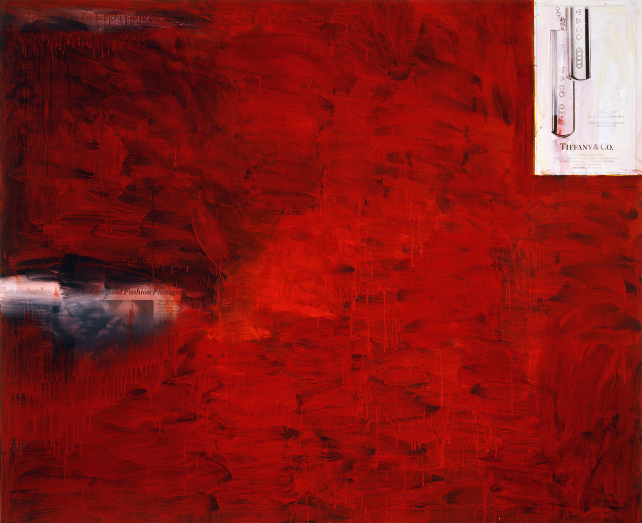
The first time i saw one of Richard Prince’s Tiffany paintings was in a bunker-type building on his compound located outside Rensselaerville, New York, a sleepy little town located some 140 miles north of New York City, one as hard to find as it is to spell. Richard was in the process of putting the finishing touches on his de Kooning Women series. The Tiffany paintings were quieter than the other paintings we saw that day; they reminded me of the cover Richard made for his novel, Why I Go to the Movies Alone, the one featuring a strange photo of an earring floating on a leafy branch. I’d heard rumblings that Richard’s Tiffany paintings might be something he’d been holding back, saving for a rainy day.
I always found it strange that he chose to live so far upstate.
I chalked it up to his having kids in school, and to his wanting to avoid distractions. I saw Richard rather like I saw Eddie Albert’s character in the television show, Green Acres: a guy who rejected the air-conditioned nightmare in exchange for rolling hills, but who was always aware of the cosmopolitanism he abandoned. “Keep Manhattan, just give me that countryside” — or so went the show’s theme song. I think it’s worth remembering that the Tiffany paintings were conceived in a rural environment. When viewed together, they echo that old saying about the three most important qualities of any piece of real estate: location, location, location. Coupled with well-chosen obituaries, they look like 2-D tombstones. Whereas Richard’s cowboy pictures left Marlboro men away from their home on the range, his Tiffany paintings are firmly cemented in place as being rogue geographic multipliers, postcards taken off the ledge of free association: association appropriation, if you will. They share a secret with the white arrow embedded in the FedEx logo — a symbol visible to all, but noticed by few, like the baby-face shadow in Warhol’s famous still life of a skull.
Pattern recognition, particularly that found in print media, is Richard’s strong suit: fancy watches synchronized to ten after ten, models looking in the same direction, the effect of a generic living room set, the conspiratorial nature of branding. Richard reads a tabloid as if it was an arrangement of tea leaves and then relays its message to the rest of us. There’s a sense of comfort — relief, even — in his recognition of such repetitions, and in his way of making artistic sense of the world. It’s sad, in a way, that marketing can calm our collective nervous bipolar condition, but it’s true — maybe the only truth left in advertising.
Ads for Tiffany & Co. in The New York Times are like comfort food by Madison Avenue shown by Mad Men — thanks, Larry! A 3-x-7-inch black-and-white ad for luxury (no degradation is necessary) above the fold, stage left, every single day, and the only thing you have to do is turn to page A3, upper-right-hand corner. Oddly enough, the paintings dovetail with Richard’s earlier joke-paintings: perfect one-liners, as it were. The copy veers towards the naughty (“cuff that man”) and the vaguely militaristic (“rings of engagement”) with a couple of traditional stabilizers thrown in for good measure — something old, something new — and its tone often suggests subservience over sensuality, a culture where consumption trumps romance.
Seven years in the making, born at the crossroads of his de Kooning paintings and his After Dark series, Richard’s Tiffany paintings are far less butch than these others, perhaps expressing his softer side for the softer sex. They’re as all-American as a biker chick or a cancelled check, though probably it’s the rich who’ll love them most. They’re sparkly obits of our era. Shout-outs and obits — is there really any difference between them? Both say, “I matter,” like being photographed by Bill Cunningham or Terry Richardson. By adhering to these formats the ads in the Tiffany paintings act almost like control groups, allowing Richard the freedom to abstract the rest of the paintings’ surfaces — or not. I found it funny that the only painting he decided to keep for himself features a gold-colored canvas labeled, “Undecided.” Leave it to Richard to have it
both ways.
[Table of contents]
Elisa Sednaoui
by Mario Sorrenti