Purple Magazine
— Purple 25YRS Anniv. issue #28 F/W 2017
Robert Stadler
design
at the noguchi museaum
interview by MIKAEL ZIKOS
portrait by ALEX ANTITCH
photography by OLIVIER ZAHM
in “Solid Doubts,” Robert Stadler’s exhibition at the Noguchi Museum
All Robert Stadler works courtesy of the artist and Carpenters Workshop Gallery, Paris
All Isamu Noguchi works, collection of the Noguchi Museum, New York
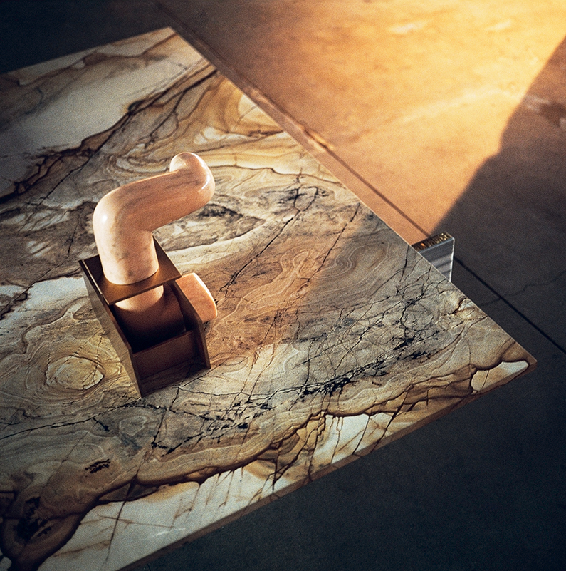 ISAMU NOGUCHI, PINK JIZO, SCULPTURE, MARBLE AND BRASS, 1960; ROBERT STADLER, CUT_PASTE #8, TABLE, MARBLE AND ALUCORE, 2015
Robert Stadler was born in Vienna in 1966. In 1992, he cofounded RADI DESIGNERS, an experimental group famous for uncanny industrial objects whose role in the history of design is something like that of an alternative music group. Since the turn of the millennium, Stadler has gone on to create his own products and installations for manufacturers as well as museums and galleries. Fun, suprising as well as functional, his pieces embrace the hardness of reality yet enable possibilities to emerge from their absurdities. His show at The Isamu Noguchi Foundation and Garden Museum in Queens just closed. This fall, Stadler is opening a new exhibition at a temporary outpost of Workshop Gallery in San Francisco. He’s also working on a bistro chair for the venerable French brand Maison Drucker. We caught up in his Paris studio.
MIKAEL ZIKOS — We could have met at the first Corso restaurant you designed in Paris; it still feels relevant, as does the graphic identity by M/M (Paris). Are you afraid of time passing by?
ROBERT STADLER — I think I create to make my passage on earth a little more enjoyable; it’s my reason for being. The challenge for Corso was to make a contemporary bistro, but not one that was over-designed. I gave the concept to the Costes group in 2007, and they began to do franchises. It also gave birth to a few mass-produced lighting designs and pieces of furniture such as the beechwood chair I did for Thonet. Some of my best-known projects, like Pools & Pouf! — a deconstructed version of the Chesterfield sofa, which barely ran off an edition, with few copies since 2004 — are for most people only part of the contemporary design imagery. I never believed in the “design for all” universal motto. Bruno Munari and Alessandro Mendini’s manifestos surely have a greater resistance to time.
MIKAEL ZIKOS — Could your work be described not as “art” or “design” but simply “transdisciplinary projects”? It still feels like there’s a crack between what the art market would like to pigeonhole as “collectible design” and what the collectors really like.
ROBERT STADLER — Yes, for me functionality is not a precondition for an object to be labeled as “design.” And the people who buy my works have no accurate profile, although they are more aware of contemporary art. Some people get my ideas; many don’t. I like my objects to be independent, to be free of any intentions. Isamu Noguchi was one of the first artists to work beyond categories and what the art market wanted to define as “design art.” It’s like fashion: punk aesthetics are appreciated now, but most people are still slow to assimilate things that are out of the ordinary. I have a great pair of red boots, and I get noticed each time I wear them.
MIKAEL ZIKOS — You just had a great show at the Noguchi Museum in New York. Isamu Noguchi (1904-88) was a genuine master who did sculpture, objects, and furniture within his own logic. How did you apply your thinking there?
ROBERT STADLER — Dakin Hart, the museum’s senior curator, invited me to exhibit because he thought that my work had similarities with those of Noguchi. Everything was art for Noguchi; his objects were more conceptual than they seem. He considered his famous Akari paper lamps “light sculptures,” and his public installations “functional spaces.” What mattered to him was how to transform a space and live in it. He also combined noble and organic materials such as stone with industrial materials like aluminum, and he was never interested in creating perfect forms. I’ve always approached creation in these same multiple ways as a designer. We therefore selected pieces from the archives with Dakin so that I could interact with them. Inside the museum, For example, a few whitewashed plywood props Noguchi made for Martha Graham’s dance Herodiade in 1944 were shown along with my PDT cut-stone series in travertine. And my Cut_Paste series was, as Dakin would say, “accessorizing” Noguchi’s rare sculptures. These pieces are an assembly of lightweight aluminum panels and different marbles I made for Carpenters Workshop Gallery in New York. In my opinion, this exhibition at the Noguchi Museum was not a solo show: it was more of a “duo show” with Noguchi. The catalogue is in the making and is due to be released this September.
MIKAEL ZIKOS — This was not the first time your vision confronted a historical figure of the decorative arts; you were previously invited to interact with the Adolf Loos apartment in Vienna.
ROBERT STADLER — That was in 2008. Having a look at the past is important and has always been natural for me. I also did a project in the Geymüllerschlössel outside Vienna in 2014. It’s the former private residence of a clock collector, now owned by the city’s MAK Museum; it seemed abandoned and looked as if there were ghosts living in it. One of my ideas was to replicate the house’s carpets and wooden floorboard patterns onto furniture dust covers dating from the Biedermeier era, as if the owner just had left the house
MIKAEL ZIKOS — In your survey exhibition at the Museum of Decorative Arts in Dresden, your works were mixed with masterpieces ranging from works by Lucas Cranach the Younger to anonymous artifacts. This follows your “Quiz” exhibitions (2014-16), which randomly associated different typologies of objects.
ROBERT STADLER — The museum invited me to do my retrospective by exploring their amazingly rich collection, from Meissen porcelains to astronomical instruments. My selection within it was arranged with objects of mine chosen without any particular criteria, like when you’re searching for images online. This show played on the confusion between images and products today, and its title — “You May Also Like: Robert Stadler” — was also referring to the commercial offer, which is now generated by algorithms matching a potential buyer to a product. There were also six works from my personal art collection and two contemporary things that I find very odd: a box of food proteins and an electronic cigarette; [the cigarette] was an organic and sensual object, and now it looks like a Dictaphone, which I think pretty sums up the state of our civilization!
 FROM LEFT TO RIGHT: ROBERT STADLER, PDT, TABLE, ASHLAR, 2015; ROBERT STADLER, PDT, BENCH, ASHLAR, 2015; ISAMU NOGUCHI, AKARI [30A], LAMP, PAPER, BAMBOO AND METAL, 1954; ISAMU NOGUCHI, CLOTHES RACK FOR MARTHA GRAHAM’S “HERODIADE,” PLYWOOD AND PAINT, 1944; ROBERT STADLER, PDT, MIRROR, ASHLAR, 2015
MIKAEL ZIKOS — Which objects of yours do you use the most at home?
FROM LEFT TO RIGHT: ROBERT STADLER, PDT, TABLE, ASHLAR, 2015; ROBERT STADLER, PDT, BENCH, ASHLAR, 2015; ISAMU NOGUCHI, AKARI [30A], LAMP, PAPER, BAMBOO AND METAL, 1954; ISAMU NOGUCHI, CLOTHES RACK FOR MARTHA GRAHAM’S “HERODIADE,” PLYWOOD AND PAINT, 1944; ROBERT STADLER, PDT, MIRROR, ASHLAR, 2015
MIKAEL ZIKOS — Which objects of yours do you use the most at home?
ROBERT STADLER — The Triple V table, in Alucore and travertine (2011); another one in marble from the Exercise series (2011); and a toaster I made with RADI DESIGNERS for Moulinex (2005).
MIKAEL ZIKOS — How are you consciously or unconsciously influenced by art?
ROBERT STADLER — Contemporary art is the thing that enriches me the most. I collect, but I’m not excessive like some of my friends. The artists who fascinate me are those whose practices are subtly disobedient, like Richard Artschwager, or those whose
work is the opposite of my operating mode as a designer, such as Aaron Garber-Maikovska, whose paintings are very focused on the line. Both are in my art collection.
MIKAEL ZIKOS — Do you mostly use the computer to create?
ROBERT STADLER — The shapes I draw are messy; they are not the final shapes of my objects, unlike other designers such as the Bouroullec brothers. We do a lot of prototypes in my studio, then it’s a back and forth between the model and its 3-D version. I drew a fan when I was studying at the Istituto Europeo di Design in Milan; it was the early days of computer-assisted design. Now this prototype is a case study for students! I also remember one of our first exercises in Milan, which was to take apart all the components from a VHS tape and draw them. It was very informative. Now I often think of this when I take part in a jury to review projects of young and “digital-native” students.
MIKAEL ZIKOS — You work with a wide range of clients, from manufacturers to art and design galleries. How do you stay true to yourself while giving them what they want from you?
ROBERT STADLER — I limit myself to not making conceptual objects. Concepts belong to philosophers; designers are too nice. I’d rather ask myself: What can I do that makes sense in this world of overabundance? The thing is, designing for design galleries is constricting because the final product has to be flawless. I have no example of a serious design gallery that would sell a nothingness such as Martin Creed’s crumpled A4 sheet of paper.
MIKAEL ZIKOS — There are many distortions in your work, like Thing #1 and Thing #2 (2016), which look like strange shelves made of resin-coated Fiberglas covered in hydrographic paint commonly used for cars, and 24h Linda and 24h Tanya (2005-08), wall clocks that slowly unveil faces of porn stars. Is bad taste important?
ROBERT STADLER — Design is too “real,” and the notion of “good taste” has always puzzled me. Going beyond common taste interests me because it allows me to use different kinds of material and to push ideas forward. Some of Noguchi’s sculptures could be considered ugly, but they’re also fascinating. It seems bad taste doesn’t exist in the contemporary art sector, or maybe just on a commercial scale… It’s probably the same in fashion, although designers like Rei Kawakubo appear to stand out, to embrace the past, the present, and the future.
MIKAEL ZIKOS — Is that why you launched your own online store, TheWhatness?
ROBERT STADLER — I wanted it because most of my work doesn’t belong to the traditional commercial circuit, and I needed to show it all at one glance — from my books to my mass-manufactured products and the ones I produce in small series — some at reasonable prices.
MIKAEL ZIKOS — You’ve been based in Paris since the ’80s. How Viennese do you feel now?
ROBERT STADLER — I grew up in Austria, and I still remember the first art exhibitions I saw: Bernard Rudofsky, Frederick Kiesler… There are so many forms of high radicalism and violence in Austrian art, which has to do with the country’s dark times, its history. Take Elfriede Jelinek’s books, Michael Haneke’s movies, or even Viennese Deconstructivism, and the Actionist performance movement, which was very bloody. Well, I’m not interested in using human flesh as a material… not yet.


